New Stats Page!
In celebration of the 10th year of Powerfund Portfolios, we're introducing a new “Stats” page. You can access by clicking on the Stats link from the portfolio’s submenu (or just click here to view the Conservative Portfolio stat page, here for the Aggressive). Here’s a quick tour:
QUICK FACTS
In this section, you'll find the following statistics:
1) Average Expense Ratio – This figure represents the weighted average net expenses of the underlying funds and ETFs.
2) Minimum Investment Reg/IRA – The amount of money required to build the portfolio and meet all of the fund minimums for both ordinary accounts and IRAs. (Many funds discount the minimum investment for IRAs.) Those with smaller portfolios can consider lower-minimum alternatives from our Favorite Fund list.
3) Number of Holdings – This is the number of funds in the portfolio (not the number of stocks and bonds in the underlying funds).
4) Risk Level –Based on our best estimates, a high-risk portfolio like our Aggressive Portfolio can fall 30-50% in a bad stock market that declines 50% or more, while a Moderate portfolio can fall 15-35%. Those seeking even lower-risk portfolios should allocate more to cash, CDs, and bonds and less to the investments in our model portfolios.
5) % Stock Funds – The current allocation to funds that primarily own stocks.
6) % Bond/Cash/Other – The current allocation to everything else, although income oriented funds will be the primary focus.
7) Current % Risk of the S&P 500 – The ratio of risk the portfolio has exhibited relative to the S&P 500 recently. Note that this figure is not always accurate after we make a change to the risk level of the portfolio, and our risk as a percentage of the S&P 500 tends to increase when the market slides and we increase stock allocations. In addition, risk as percentage of the S&P 500 may be low if bonds tend to go up when stocks go down, but if both fall in unison our risk relative to the S&P 500 can go up with no change in the portfolio makeup.
8) Standard Deviation – The annualized standard deviation of the current portfolio.
9) Average Holdings Period – The length of time we’ve owned a fund position, on average. We rarely own funds less than one year primarily due to tax and fee concerns, but also because our strategy of buying out-of-favor funds and categories often leads to longer holding periods.
10) Average Stock Fund Turnover – The weighted average turnover (how frequently the manager turns over the holdings in the portfolio) of the stock funds in the model portfolio.
11) Portfolio Inception – The day we started the portfolio and the beginning data of the Since Inception returns.
12) Last Trade – The last trade in this portfolio, not including internal rebalancing that doesn't change the actual holdings list.
ALLOCATION PIE CHARTS
The “Broad Allocation” chart shows how the portfolio is currently allocated to stock, bond, and alternative/other funds. Note this chart does not take into consideration fluctuations in the value of the funds, so today we may be 66% in stock funds, not 65%, solely due to market movements. What you're actually seeing is the allocation you would be in if you built the portfolio today.
This chart also doesn't take into account underlying fund holdings, so if we were 100% in stock funds and some of those funds owned significant cash stakes, we would still say we were 100% in stock funds. Alternative/Other funds are funds or ETFs that don't categorize well, and could include funds that short or own alternative assets, like U.S. Dollar futures.
The “Categories” chart shows the portfolio's allocation to the different fund categories. We use the same color ranges from the broad allocation chart, but show how much is in, say, Europe funds as opposed to how much is in larger-cap value funds, and so on. Like the broad allocation pie chart, this pie chart doesn’t take market fluctuations or underlying holdings into consideration. It simply shows the official allocations of the portfolio.
PORTFOLIO VERSION HISTORY
This flip-tastic table lets you scroll through the entire 10+ year history of each portfolio so you can see what investments the portfolio has held over the years. To view different time periods, click on the arrows that appear before and after the date heading:
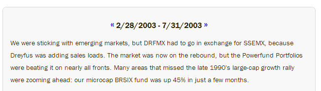
When the date says “2/28/2003 – 7/31/2003” you're looking at the portfolio holdings following the trade that occurred on 2/28/2003, and which remained in the portfolio until 7/31/2003 when the next trade happened.
You'll see the actual percentage each fund represented in the overall portfolio, the category the fund was in, and most importantly, how the fund performed during this time period (including dividends and fund expenses, but not including commissions paid to buy or sell the fund, if any).
Also note for reference how the entire portfolio performed compared to the S&P 500 WITH dividends on the bottom right of the table. When you see green numbers for “Period Portfolio vs. S&P,” that means we beat the S&P 500 by that percentage during that period.
The Portfolio Version History shows you exactly what we owned and when, and how we did so well over the years - where we went right, and where we went wrong. You'll also see the importance of beating the market during downward moves in long-term, market-beating returns, and you'll get some idea of how much risk we usually take for each risk level portfolio and how that can change on the way down and up.
At the top of each era of flip history, we summarize what we were thinking during that time period.
0 COMMENTS POST A COMMENT